
Good UX or dark design?
When I saw Amazon's call for donations to fund sick pay for their workers amid the covid-19 pandemic, my mind was blown. Publishing that banner on Amazon's website was a big decision. Multiple groups of people approved it and thought it would make Amazon look good. These are not rocket scientists, or even thoughtful human beings.
Convenience at a cost
The convenience of shopping on Amazon Prime is destructive to the environment, human rights, and small businesses. Just imagine what would happen if the millions of people who posted black squares on #blackouttuesday cancelled their Amazon Prime membership and shopped local instead. That sounds pretty patriotic to me.
Cancelling Amazon Prime costs $0 and takes about 1 minute. I took notes along the way about how Amazon's website is designed to look super helpful as they intentionally try to manipulate you into at least paying out your membership for the rest of your annual contract.
Want to learn what that process looks like? Join me on my mission to cancel Amazon Prime.
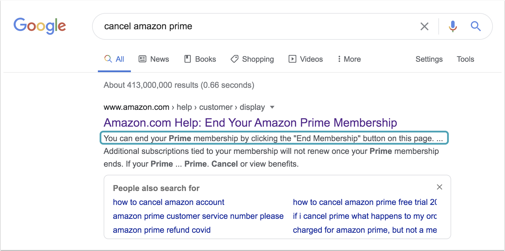
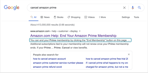
Step 1: the Google
Seems easy enough. +1 for the meta description.
Step 2: the misdirection
This seems almost too easy.
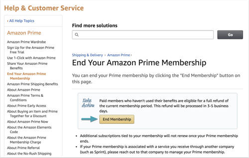
Step 3: the fake-out
Oh, OK. I thought I was cancelling with one click. But I guess there's a 3-step flow I need to move through. I have some thoughts (below).
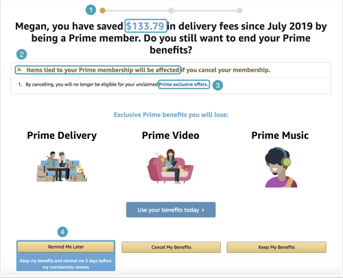
- Hmm, what's all this money?
- "Items tied to your Prime membership will be affected" is giving me questions. Which items? The items displayed below (Prime Delivery, Video, and Music) are defined as "benefits" not items. And that alert symbol makes this seem like something bad might happen. So now for some reason I'm concerned I'll owe back this $133.79 in savings.
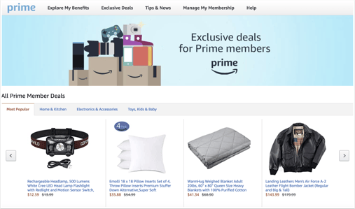
- What are these Prime exclusive offers, you ask?
- Oh, don't worry, they're just slightly discounted but still overpriced items you don't need.
- Am I sure? Yes. Well, just look (below). There's a headlamp flashlight and an XL mens leather jacket. Sounds tempting, but I think I'll pass.
-
- Clicked the back button at the top of my browser to return to the cancellation flow.
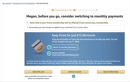
Step 4: a simple offer
One last time to make you feel guilty and bad inside.
- Switch to a monthly payment? No.
- Wait, are they offering free memberships to frontline people, like EMTs? That would actually be really cool, and I'm pretty sure they could afford it. Oh wait, no, I misread that. It's Medicaid or student rates. Which aren't really much of a bargain. Ugh.
- OK, definitely this time, when I click Continue to Cancel, I should be done.
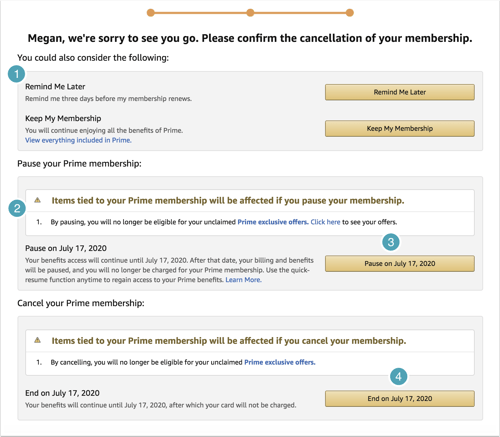
Step 5: the guilt
Wow, this is a lot. And literally none of these buttons say "Cancel."
- You could always consider either of these two options (which are the same option): don't cancel.
- Scary alert icon with a warning that "items" will be affected. Which items do you mean, Amazon? On the previous page, you said I get "benefits" from my Prime Membership.
- Pause instead of cancel. What's the difference? Are you really trying to pitch me those weird (still overpriced) items that have nothing to do with my life?
- End on July 17, 2020. Fine, I'll take it. But "End on X date" still doesn't sound like "End Membership" experience that was promised. Somehow it still feels like Amazon is winning because I can't cancel today and get reimbursed for the rest of the month I already paid for.
Epilogue
Technically, it wasn't too difficult to complete the steps required to cancel. But the details in the UI copy and the alerts intentionally created anxiety, uncertainty, and fatigue. All intended to make it easier to abandon the process rather than pursue your original goal.
That's the unfortunate downside of deceptive design.